Are you worried about the potential financial burden of hiring an interior designer? Yes, the cost is always a factor to remember, but seeing these cringe-worthy interior design fails will make you thankful you hired someone who knows what they’re doing.
And while we find these designs hilarious, we also empathize with the homeowners who must wake up to these designs every day. So take a moment to chuckle at these decor disasters while noting things to avoid in your own space!
Someone Needs To Flush This Design Idea Down the Toilet
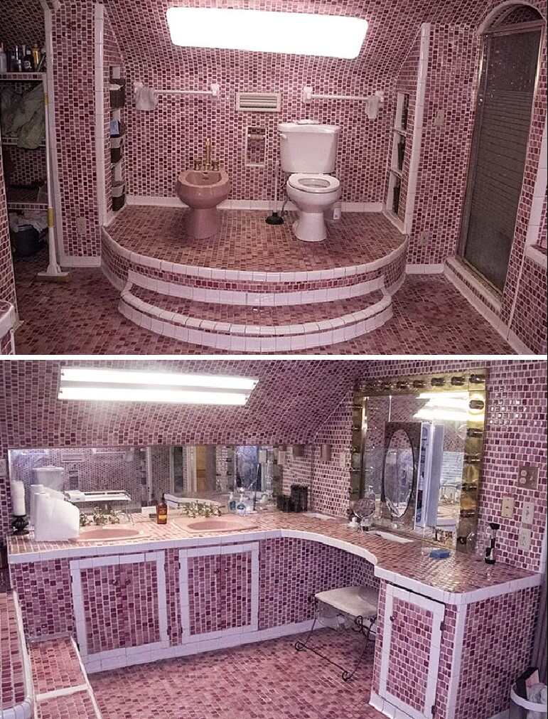
When it comes to bathroom designs, there are many options—minimalistic, traditional, modern, rustic looks, etc. But some design choices can take a turn for the worst, and in this case, we think someone has made a grave mistake by opting for cola-colored penny tiles.
The designer went too far, covering every inch of the bathroom in it. The result is nothing short of appalling, especially for those with trypophobia.
De-Puff This Kitchen
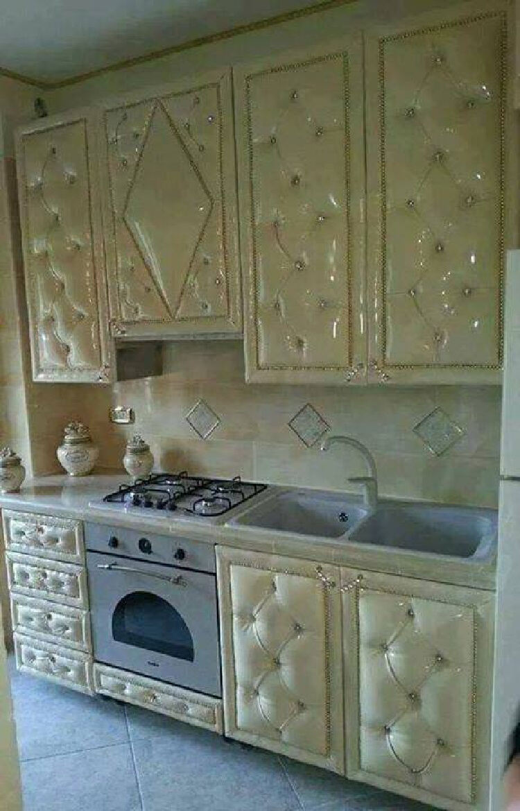
If these homeowners were going for a “Stay Puft Marshmallow Man” aesthetic, we’d say they nailed it. Of course, this isn’t the most visually appealing design, but let’s leave that aside and talk about the potential hazards of this decor choice.
Tufted items trap dust and other harmful substances, so it’s best not to go overboard. After all, your health and well-being should always come first, right?
Watch Your Reflection While You Flush
We think this mirror should have been placed in a different part of the bathroom. After all, who enjoys watching themselves flush?
This view isn’t exactly what anyone wants to wake up to. Plus, it comes with some health concerns, as it can expose you to bacteria and germs during flushing. So, if you think hiring an expert designer is costly, think about what happens when you don’t!
A Home Design Death Trap?
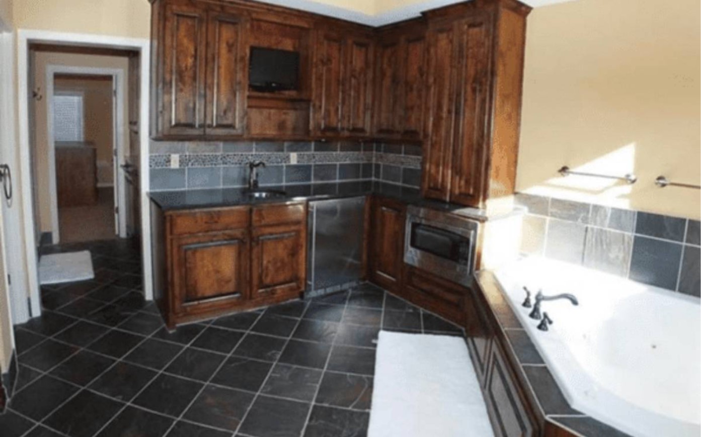
We’re not saying that whoever designed this house had sinister intentions, but it’s hard not to think that when we look at the setup of this kitchen/bathroom hybrid.
With a simple ‘’unintentional’’ drop of the toaster in the bath water, there would certainly be a catastrophic turn of events. It’s best to leave the appliances as far away from the tub as possible, just to be safe.
When Mughal-e-Azam Is Your Architect’s Inspiration

When it comes to architecture, one can draw inspiration from different places, from natural landscapes to modern art. But your house could turn out like this if your architect draws inspiration from Mughal-e-Azam!
This balcony is nonfunctional, and anyone looking for a safe and spacious balcony will undoubtedly be disappointed. But, again, this is why you need a professional to design your home!
Break a Leg, Literally
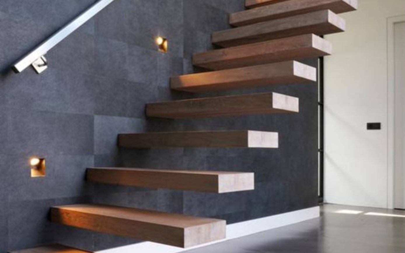
This designer definitely took the phrase “break a leg” to heart. In fact, we think two legs will be broken if one isn’t careful on this floating staircase.
Just looking at this picture makes us dizzy, and it would certainly not be an option if you had kids or pets in the house. We think the designer’s attempt to take home design to risky new heights was unsuccessful.
Watching the Soaps
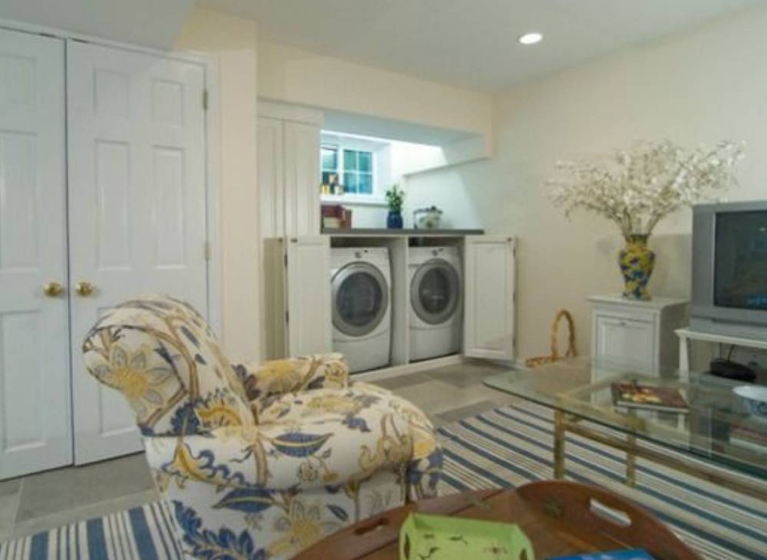
Why would you watch a soap opera when you can literally watch the soaps near your TV? We don’t know what this designer was thinking, but this has to be one of the strangest home designs we’ve seen.
And while it would be convenient to throw in a load of laundry while enjoying a streaming marathon, would you even be able to hear the TV with the washer and dryer going?
Sometimes, Creativity Takes You a Long Way
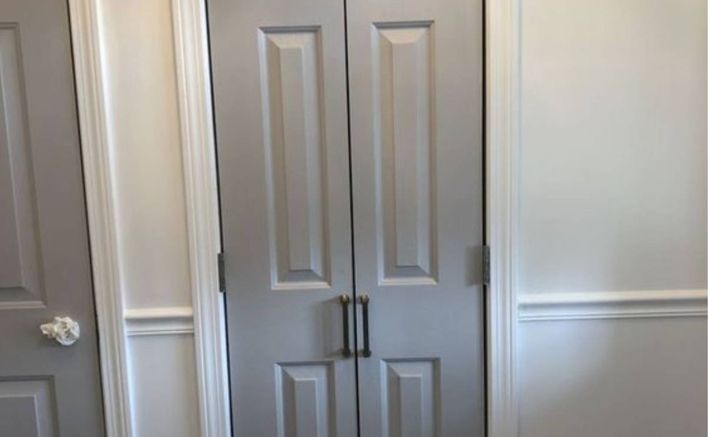
Creativity often propels us to greater heights, but this is definitely not one of those cases. Will two mini doors start replacing the full-sized versions sometime soon? We certainly hope not.
The homeowner would definitely have a hard time opening this door, and they will struggle to get themselves in. Where in the world did this designer get their inspiration from?
Bathroom in a Staircase
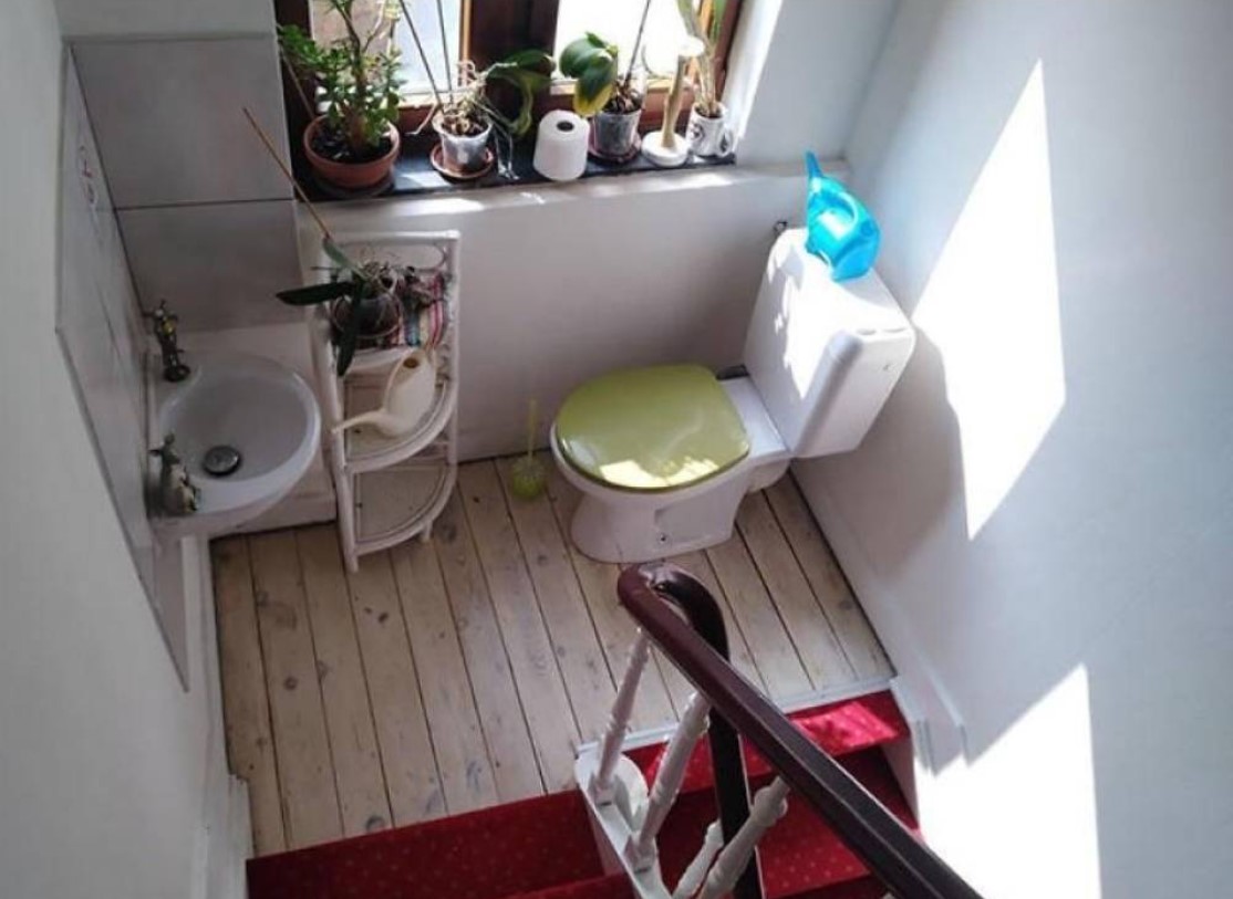
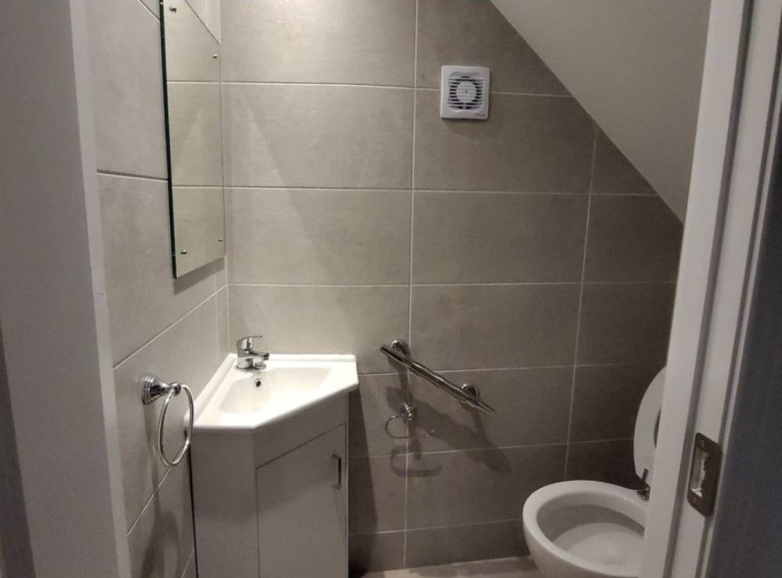
As we examine this space, we end up with more questions than answers. We are even more perplexed at the thought of many people cohabiting in this limited space. How is the plumbing done for this? Also, did the designer think this was a clever move? What about the potential health hazards?
This little space will definitely restrict the flexibility of the occupants of this home. We also wonder how many times someone has taken a tumble down the stairs while using the toilet.
Caramel Brown, Anyone?

The shade “caramel brown” sounds delicious, doesn’t it? Well, even if this color is your absolute favorite, it’s probably best to avoid covering your entire bathroom in it.
This is a perfect example of why this shade should be banished from all designs. So please, take our advice and save yourself from this ghastly mistake!
Desperate for a Kitchen lsland?
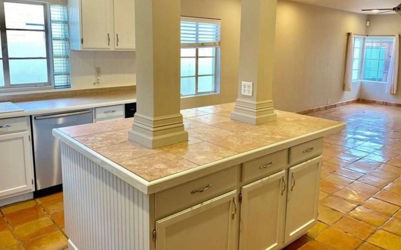
Did this homeowner want a kitchen island so badly that they didn’t consider the consequences? Imagine trying to hold a conversation in this bizarre setup.
We don’t know if this is a result of a bad interior designer or an incompetent home builder, but we know this for sure—this kitchen island is one of the weirdest designs we’ve seen.
Someone Took Trendiness a Bit Too Far
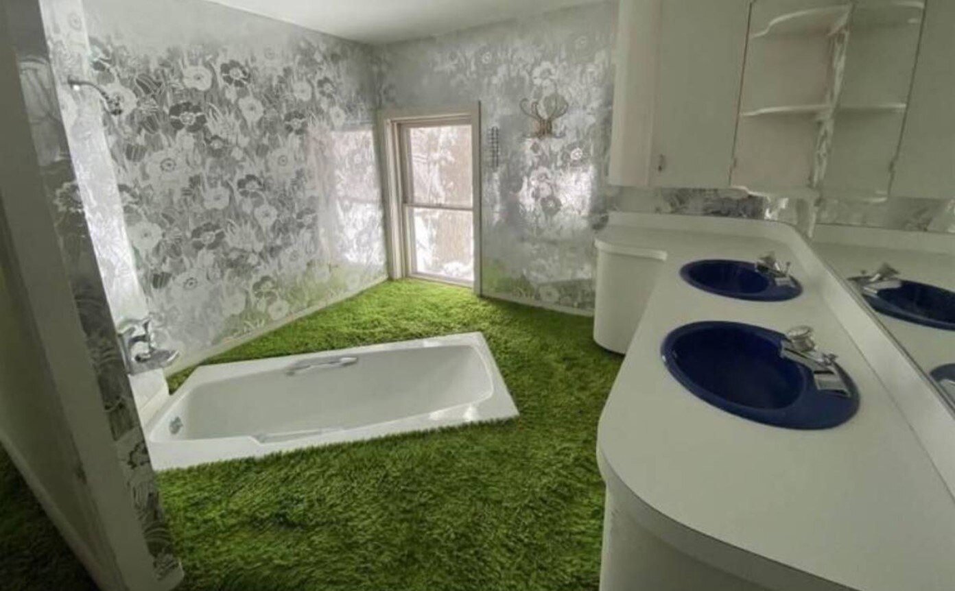
The architect responsible for this design went overboard and put hygiene in the backseat. It’s as if they have thrown every sense of reason out of the window in their attempt to create a “trendy” style.
We can’t help but wish we could meet this designer for a chat. We just want to talk!
The Claustrophobia is Real
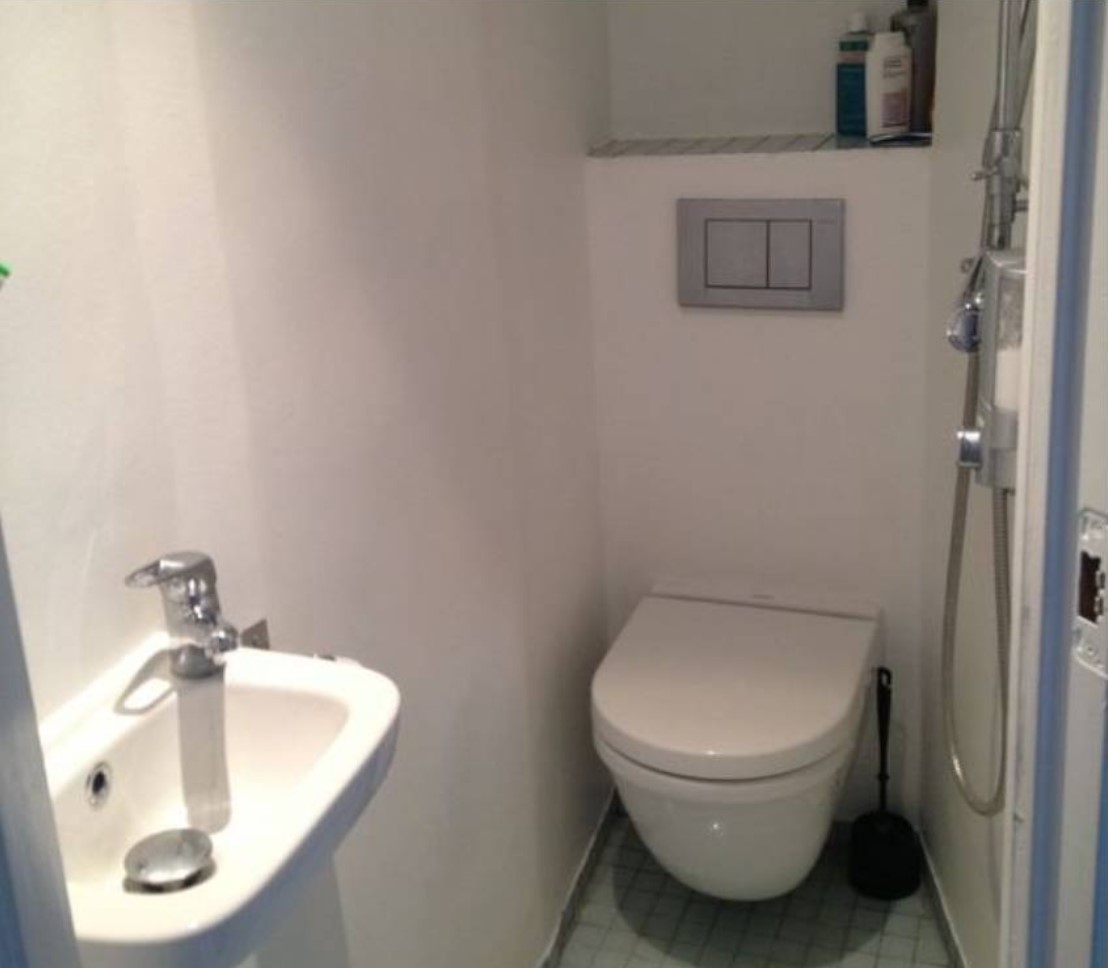
This is definitely a horror movie waiting to happen. Could you even breathe there? Imagine being in there and suddenly feeling trapped. The bathroom walls begin to close in, and you feel the room shrinking. Claustrophobia sets in, and you can’t escape!
If you want to prevent a horror-movie-restroom experience, we totally recommend hiring a professional for your bathroom design.
Flush Where You Bathe
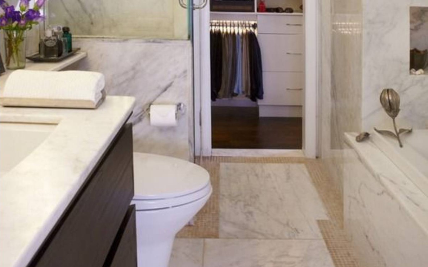
The standard clearance for a toilet is 15 inches. Unfortunately, it looks like many designers are failing to meet this requirement. As if that wasn’t bad enough, this interior designer went too far and completely ignored the standard distance!
It’s so easy for poor design choices to lead to an unhealthy and uncomfortable experience. You deserve way better than this catastrophic bathroom.
What Could Have Led to This?
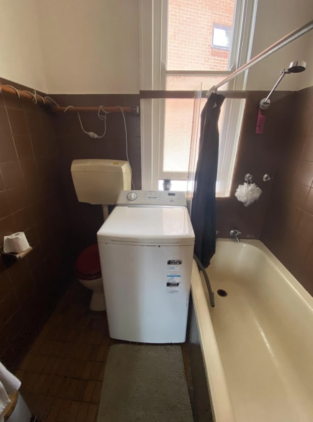
If this home had “bathroom and laundry room” on the listing, it was incredibly misleading. How could you even sit on that toilet normally? Or do a load of laundry, for that matter?
We empathize with this washing machine, though. It’s clearly feeling out of place and uncomfortable. We can almost hear its lonely cry as it says, “Mom, come pick me up!”


