William Morris, public domain, via Wikimedia Commons
Walk into almost any wallpaper showroom and you will find William Morris somewhere on the shelves. Thrushes pecking at strawberries, willow leaves curling across a pale ground, a dense trellis of roses. The designs are well over a century old, and they still sell to people furnishing brand-new flats.
I find that remarkable, because most interior trends have a shelf life of about five years. Think of the grey-everything years, or the brief and slightly baffling love affair with copper pendant lights. Morris has outlasted all of it.
So where did these patterns come from, and how do you use one now without your living room looking like a heritage gift shop?
A house that needed furnishing
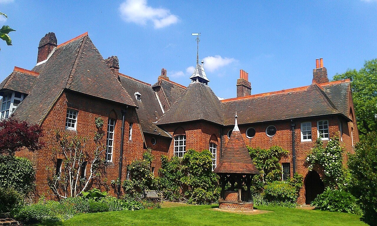
Red House in Bexleyheath, the red brick home Philip Webb designed for William and Jane Morris, with its garden well in front. Ethan Doyle White, CC BY-SA 3.0, via Wikimedia Commons
The story starts with a house. In 1859 Morris married Jane Burden, and the couple commissioned his friend, the architect Philip Webb, to design them a home in what was then the countryside of Kent. Red House, in Bexleyheath, was finished in 1860. It's red brick, steep-roofed and deliberately unfussy, and it now belongs to the National Trust.
The trouble was filling it. Morris disliked most of the mass-produced furniture and decoration available at the time, which he found shoddy and over-ornamented. He and his friends ended up painting, embroidering and designing a great deal of the interior themselves.
That experience led, in 1861, to a decorating firm: Morris, Marshall, Faulkner & Co., set up with friends including the painters Edward Burne-Jones, Dante Gabriel Rossetti and Ford Madox Brown, along with Webb. It was reorganised under Morris's sole control in 1875 as Morris & Co.
Trellis, the first wallpaper
Morris's first wallpaper design was Trellis, drawn in 1862 and inspired by the rose trellises in the garden at Red House. Webb drew the birds. It was issued a couple of years later, alongside early designs such as Daisy and Fruit.
The papers were printed by hand from carved wooden blocks, one block for each colour, by the London firm Jeffrey & Co. This was slow work at a time when machine-printed wallpaper was cheap and everywhere, and it made Morris papers expensive. There's an irony there that Morris himself was aware of: a man who wanted ordinary people to live with beautiful, well-made things produced goods that mostly the well-off could afford.
Strawberry Thief and the indigo vats
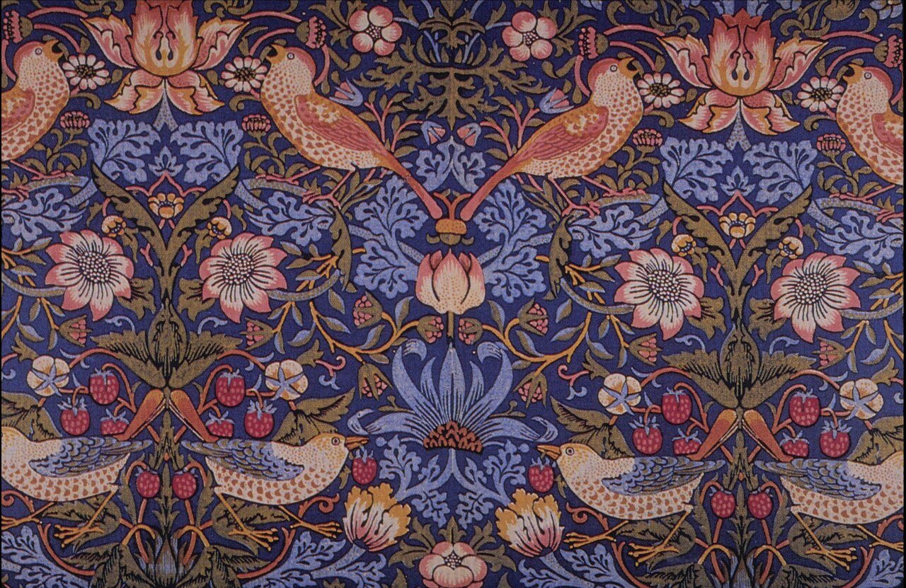
Strawberry Thief, the pattern on the cover of this piece, is probably his most famous design today. It was a printed textile rather than a wallpaper, designed in 1883 and inspired, so the story goes, by thrushes raiding the strawberry beds in the kitchen garden of Kelmscott Manor, his house in Oxfordshire.
It was made at the firm's works at Merton Abbey using indigo discharge printing, a fiddly process in which cloth was dyed blue and then the colour was bleached out and other colours added in stages. It took a long time and the fabric was among the most expensive the firm sold. You can see why it caught on, though. The birds have real character (one of them looks distinctly pleased with itself).
"Useful or beautiful"
Morris's best-known line on interiors comes from a lecture he gave in 1880, later published as The Beauty of Life: "Have nothing in your houses that you do not know to be useful, or believe to be beautiful."
It gets printed on tea towels now, which he might have found funny or appalling. I lean towards appalling. But it is still a decent test to apply to a room, and it explains a lot about why his patterns work. They were drawn from things he looked at closely, mostly plants and birds, and they repeat in a way that feels natural rather than mechanical.
Using Morris patterns in a home today
The biggest mistake I see is too much of it. A full room of a busy pattern like Strawberry Thief can feel heavy, especially in a small space with low light. One feature wall, an alcove or the back of a bookcase is often enough.
That said, small rooms can take a bolder approach than you might expect. A downstairs toilet or a narrow hallway papered floor to ceiling in a Morris design tends to look intentional, because nobody spends long enough in there for it to become overwhelming.
Pick out one colour from the pattern for the surrounding walls and woodwork. A soft green from Willow Bough or the deep blue of Strawberry Thief works far better than a plain white, which can make the pattern look like it has been cut out and stuck on.
If you're nervous about walls, start with fabric. A pair of cushions or a lampshade lets you see how the pattern sits in your room before you commit to rolls of paper.
Where to see the originals
Morris & Co. closed in 1940, but the designs never went away. The printing blocks passed to the wallpaper firm Sanderson, and Morris patterns are still produced under the Morris & Co. name. You can also see original work up close. Red House is open to visitors through the National Trust, the William Morris Gallery in Walthamstow occupies his family's former home, and the Victoria and Albert Museum in London holds a large collection of his textiles and papers.
If you're thinking about using one of his designs, I'd go and look at the real thing first. The colours in person are softer and richer than they look on a screen.